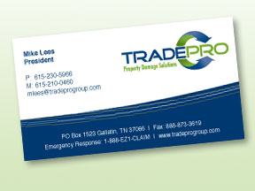
Business logos aren’t just for multi-national corporations! They’re for any business that wants to present a professional image and work on establishing customer recognition (otherwise known as branding).
How Does A Logo “Work” for You?
Your logo works for you on your business cards, your business stationery, your invoices and receipts, your business’ publications, and, of course, your advertising. Put it on your business’ signage, on your yellow pages ad, and on the side of your business’ vehicle.
If you have a web site, your business logo should be on every page of your site. Many business people also feature their business logos on any promotional materials they hand out, such as mugs, calendars, and key chains.
Why You Need A Good Logo
The purpose of all this business logo reproduction is to separate your business from the common herd of competitors and build brand recognition and preference. (Think of the golden arches.) A good business logo helps your customers remember your business and many people remember images better than they remember words.
Where To Start…
Would you give yourself a haircut or leave it to a professional? The same goes for your logo. For a truly professional look, it’s best to hire someone who knows the software and can guide you through the steps to a polished and effective logo design. If you’re in the process of designing a logo or having one designed remember:
1. KEEP IT SIMPLE. A business logo has to be simple. Simplicity of business logo design makes a logo easy to reproduce and makes it easier for customers to remember and recognize. Limit the number of colours in your business logo, and stay away from muddy colours or tone on tone designs. Think clear contrast and simple shapes when thinking of business logo design.
2. RELEVANCE. Your business logo has to have some relevance to your business. For instance, a Christmas tree shape with a bolt of lightning striking it won’t be an effective business logo for a computer consulting business. The “picture” the logo represents just doesn’t have any association with computers.
3. SYMBOL vs INITIALS. It’s no coincidence that so many business logos are the initials of the business’ name encased in a simple shape; relevant pictorial associations are hard to come by for many businesses, and a symbol that misleads will do more harm than good.
4. COLOR. Colors are powerful. Different colors have different associations and can present powerful messages in themselves. Red, as we all know, is seen as fiery and energetic. But what about brown? No matter how much you like a particular shade, it may not be a good choice for your business logo design.
5. SCALEABLE. Your business logo has to be scaleable to suit all your promotional needs. The logo you choose has to look good on a business card, on a brochure, and on the side of a bus, for instance, if that’s how you choose to advertise. Complicated business logo designs don’t scale well. This is another example of why you should hire a professional to design your logo. A graphic designer has the software needed to create a scaleable (or “vector”) logo that can be scaled to any size without looking fuzzy or pixelated.